
Background
Kirsten DeHart runs a thriving real estate business in Wood River Valley, Idaho. Her newsletter is one of her key marketing channels.
Her weekly real estate newsletter is sent with ActiveCampaign, but she wanted to move it into WordPress so that it would double up as content on her site and help with SEO. She also wanted to make it easier and faster to publish each newsletter.
As a busy broker, she didn’t have the time or expertise to set everything up, so she contacted us to help out with the implementation.
After a quick call, we agreed on the scope, then got to work!
Here’s what we did:
- Implement Newsletter Glue and resolve any issues on the site
- Newsletter audit
- Design and build newsletter
- Build newsletter archive
- Final handover
Step 1: Installing Newsletter Glue and resolving any site issues
Logging into a customer’s site for the first time is always nerve-wracking. We never know what kind of setup they have and whether it will conflict with Newsletter Glue.
In this case, the site was stable and well-built. We just needed to enable the block editor on our newsletter custom post type in order to get Newsletter Glue working, as the classic editor doesn’t work well with Newsletter Glue.
We then connected ActiveCampaign to Newsletter Glue via API and made sure it was up and running.
Step 2: Newsletter audit
Once we successfully installed Newsletter Glue, we did a newsletter audit. This involves taking a good look at every single newsletter touchpoint. This generally includes:
- Every sign up form on the site
- The newsletter landing page (if available)
- Newsletter Archive
- Newsletter preference center (if available)
- The newsletters
- Newsletter welcome email and confirmation page
For Wood River Properties, we found over a dozen high-impact improvements that could be made to improve subscriber numbers, engagement, and ultimately conversions.
For this case study, I’d like to highlight 6 recommendations we made:
1. Fixed subscriber form across the site.
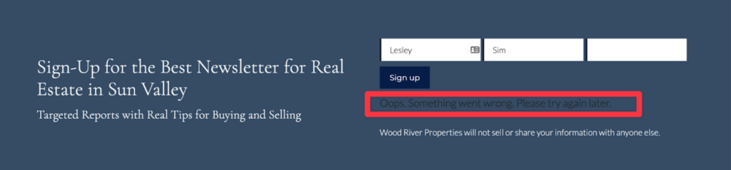
One of the first things we always do is to go to a customer’s site and sign up for their newsletter. In this case, we quickly found out that her sign up form was not working.
As a result, she was not getting any new subscribers from her site. We recreated the sign up form and tested to make sure it worked.
Takeaway:
Periodically test all your sign up forms to ensure they’re working correctly. Especially if you notice a drop in subscribers.
2. Improve subscriber form design and copy.
Previously, the sign up form had too many fields, and the button was a dark blue, which blended into the site. This hurt subscription rates as too many fields add friction to the process and the button didn’t draw enough attention.
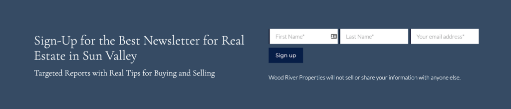
In the improved version, we removed the unnecessary fields, and made the sign up button gold, which is the accent colour on the site. This helps it stand out more.
We also recommended that she improve the copy on the sign up section. Her current headline is long and too vague. What does “best” mean?
Her subheading is much better, but could also be more specific. In addition, this section should include some social proof, which would further encourage a potential subscriber to sign up.
Takeaway:
Use as few fields as necessary (for some, this includes first name, it just depends on your newsletter writing style) and make sure your button stands out.
We also recommend 8 elements when it comes to opt-in forms. Here’s a screenshot of Josh Spector’s opt-in form for his newsletter, For The Interested, and a breakdown of the 8 elements. He’s one of the best in the newsletter business!
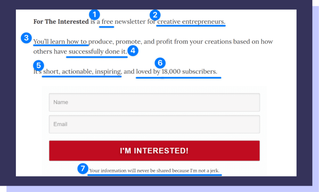
- How much will it cost? “Free” Answer the first thing on the minds of any potential subscriber.
- Who is this for? “Creative entrepreneurs” Clearly state the target audience to draw them in, while filtering out other people who wouldn’t be a good fit.
- What is this about? “You’ll learn how to”
Tell people exactly what they’ll get so they can decide if they want it. - Why should I care? “Successfully done it”
Give people the confidence that your advice is good. No wantrepreneurs. No regurgitated Twitter/LinkedIn advice. - Emotional reasons to subscribe. “Short, actionable, inspiring”
As you’re drawing closer to the form (aka making a decision), there needs to be emotional reasons to subscribe. - Hit em’ with your best shot. “Loved by 18,000 subscribers”
Keep your biggest value proposition to the end (closest to the form) and pair it with an emotion. This pushes even the most ambivalent subscriber off the fence and onto your list. - Make it personal. “Your information will never be shared because I’m not a jerk”
Subscribers worry about unethical megacorps, not people we know. This is why this is the first and only time Josh speaks in the first person. He reiterates you’ll be receiving a personal newsletter, from him, not a generic one from an unethical company. - When will I receive this? Josh misses this, but perhaps he does this on purpose so as to give himself flexibility to test. Generally though, it’s good to set expectations. Is this a weekly, daily, monthly newsletter? People want to know!
To be clear, it’s not always necessary or possible to include all 8 elements, but you should definitely try to include as many as you can.
3. Added subscriber form to every page.
Newsletters are a key marketing channel for Wood River Properties. Hence, we want as many subscribers as possible. We found that her sign up form was only on her front page, so we added it to the bottom of every page on her site to maximise the chances of someone subscribing.
Takeaway:
Add a subscriber form to every page on your site to maximise signups.
4. Improve the call to action at the bottom of the newsletter
We’re now moving on to the newsletter itself…
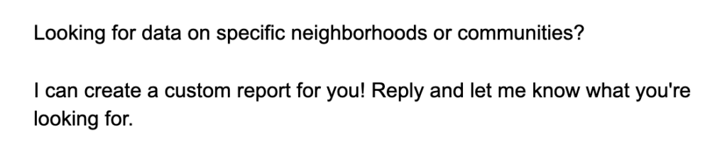
Kirsten has an awesome offer at the end of her newsletters – A custom report with data on specific neighbourhoods and communities. Unfortunately, it’s in text format and gets lost in the newsletter.
To draw more attention to her offer, we created a special section at the end of her newsletter.
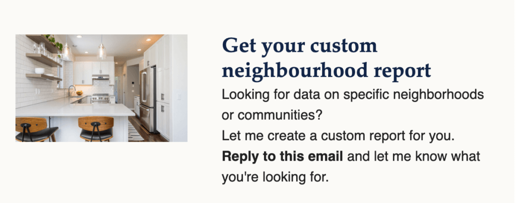
We also recommended that she improve the copy in this section to include social proof and an example of the type of information a report like this includes, and why it’s helpful.
This sounds like a lot, but it could simply be something like:
Looking for the best neighborhood for your family’s holiday home?
Let me create a custom report for you. Get property prices, and my personal opinion on the best neighborhoods. Dozens of families relied on my custom reports to shortlist and eventually buy a house.
Reply to this email to get your custom report today.
Takeaway:
What is the next step you want a subscriber to take? Be clear on your call to action in order to get more conversions and make more money. This is one of the highest leverage work you can do for your newsletter.
5. Improve subject lines
Currently, each subject line says something like “Sun Valley Real Estate Round Up” or “Sun Valley Real Estate Updates”. This is a little boring and doesn’t tell a subscriber what’s inside the newsletter.
Instead, we suggested she write her newsletter first, then shortlist 2-5 eye-catching phrases from inside her newsletter and make that the subject line.
Examples include:
- 45 new listings in Sun Valley!
- Ketchum is hopping!
- Price reductions?
- Moving out of a seller’s market
- Check out this Elkhorn residence
Takeaway:
When writing subject lines, try to pick something that will make your subscribers want to open your newsletter.
Here are some things to consider:
- Know who is reading and why. Always stay relevant to your readers.
- Write your newsletter first, then pick phrases that best describe that issue.
- Pick a trigger emotion. Before writing your subject line, decide what emotion you want to elicit. Is it curiosity? Excitement? Anger?
- Write 5-10 subject lines quickly.
- Go for a coffee/tea break.
- Come back and pick your favourite one.
6. Add additional sections to the newsletter
We looked at Kirsten’s newsletter and her blog and identified 2 additional sections she could add to her newsletter that her subscribers would find valuable.
Recently sold section.
We noticed that the site had a recently sold page but that wasn’t being reflected in the newsletter. We easily created a recently sold section using our post embed block, which allowed Kirsten to paste the links to recently sold listings and have the featured image and headline automatically generated in the newsletter.
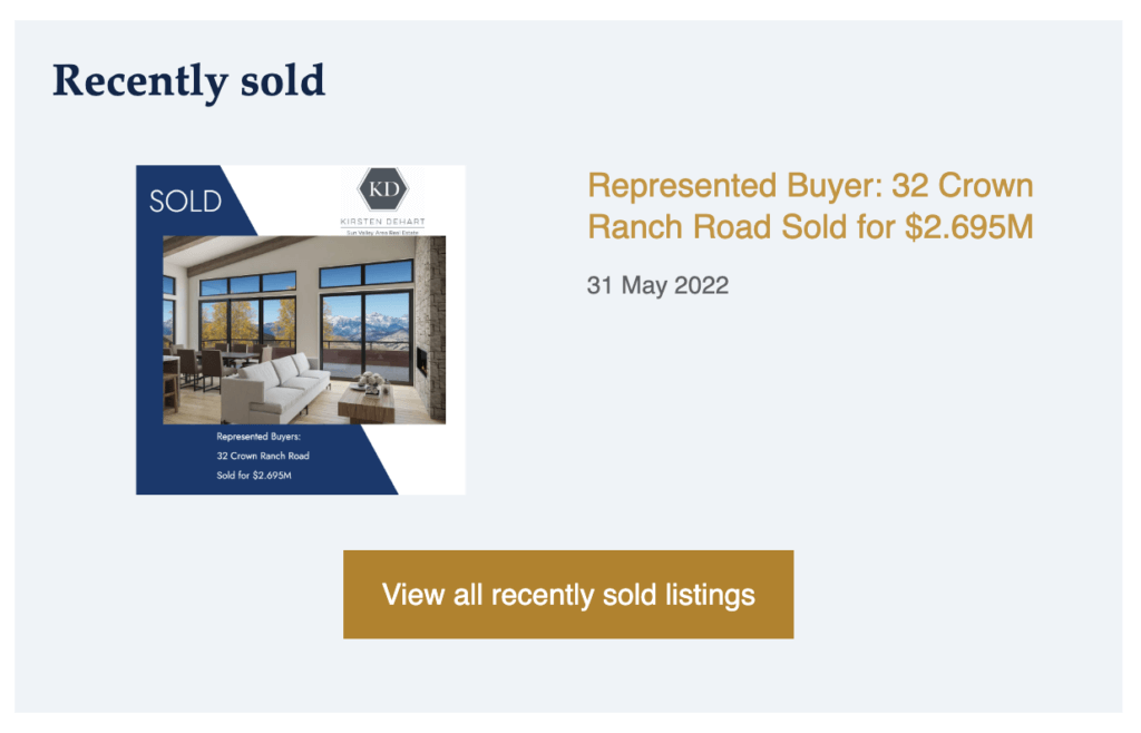
We believe adding this section generates momentum and credibility for potential buyers and sellers as they see that the market is moving and that Wood River Properties is successfully helping clients to buy and sell properties.
Takeaway:
Think about what makes your newsletter valuable and worth reading.
Then, make sure each section is optimised to provide that value to your subscribers.You can also consider removing sections, or adding new ones in order to get the results you want.
Newsletter audit summary
We shared lots of other tips with Kirsten and organised them based on impact and effort, allowing her to decide which recommendations she wanted to implement.
Step 3. Design and build a newsletter template
This is the most fun part for us – reviewing an existing newsletter design and figuring out how to improve it.
Here are the elements we look at:
- Clarifying overarching goals. Lots of people don’t have a big-picture goal for their newsletter. If you don’t know what your newsletter is trying to accomplish, you won’t know if you’ve achieved it.
- Easier to publish. The #1 reason people stop publishing newsletters is because it takes a lot of time and effort and it’s hard to stay consistent. So we’re always looking for ways to create a beautiful template for our customers that’s quick and easy to publish.
- Easier to read. We want to make sure the new design is easier for subscribers to read and skim than before. With clear sections, headings and calls to action.
- Works across all/most email clients. When it comes to email, we can’t build them like we would a website because of limitations with Gmail and Outlook. Making emails look good across email clients is always tricky, and often comes down to the complexity of the design. We try to make designs as simple as possible so that all subscribers can read it.
- Effective for you, valuable for your subscribers. We want to help you grow your business with your newsletter by making it a must-read for your subscribers.
- Consistent, on-brand, and professional. It’s easy for newsletter templates to get out of control. Over time, you want to add new sections, remove old ones, and improve existing ones. This can be difficult if you’re not a designer or have a rigid template. We help you build a template that’s flexible so that adding new or seasonal sections are easy, but also looks consistent and professional even when you’re updating on the fly.
Here’s what the newsletters looked like before.
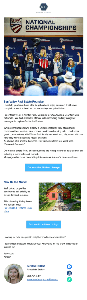
Immediately I noticed a few things:
The good:
- The personal images were really nice and helped the newsletter feel like they come from a real person.
- Similarly, the intro at the top had a nice personal touch too.
- Not too many sections, pretty clean and simple to read.
- The New on the market section was very clear and crisp.
To be improved:
- Inconsistent content. Sometimes there was an image at the top, sometimes it was a market report.
- The market report image was created from scratch every single time. It wasn’t always added to each newsletter, because it’s a chore to create!
- The market report is also one of the most important parts of the newsletter, but it was in image format. This means subscribers who have images disabled by default wouldn’t be able to see this market data!
- Aside from the New on the market section, other sections, like latest blog posts were missing clear sections and labels.
- The call to action at the end “I can create a custom report for you!” was really compelling, but it isn’t eye-catching.
- Kirsten’s picture in her signature is too big.
- Her buttons, links and headings were not on brand. Check out the weekly market report image on the top of the right newsletter, those are her brand colours, unfortunately, they’re not reflected anywhere else in her newsletter.
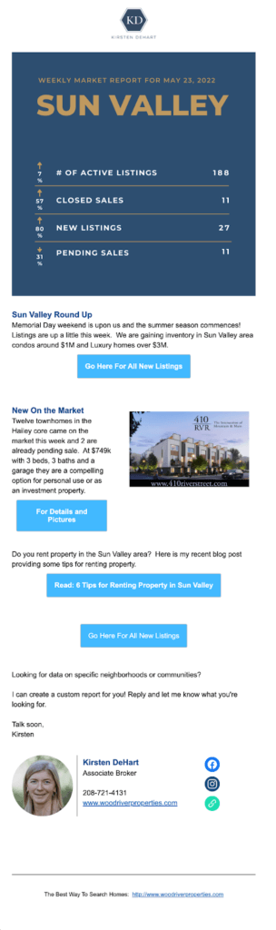
The final newsletter

Improvements made:
- We made everything on brand. We took the colours from her website and applied them to the newsletter. Immediately, everything looked more professional.
- We created clear and labelled sections so that it’s much easier for subscribers to read.
- We turned the market report into a well-designed table, so it takes seconds to update each week. It’s also much easier for subscribers to read.
- We built a template, so each week it feels more like filling out a well-designed form, rather than starting from scratch. And if there isn’t content for a particular section, like events, it is easy to delete.
- We made use of our post embed block across the newsletter, which means adding new content is as easy as pasting a link. From there, our post embed block pulls the featured image, heading, and excerpt straight into your newsletter. Making sharing content a breeze.
- We also added a Recently sold section to her newsletter. After exploring her site, we noticed there was a recently sold section. And found that would be excellent content for the newsletter as it is a subtle signal that not only is Kirsten a great real estate agent, but also that the markets are moving, and that would encourage buyers and sellers to get off the fence.
- We used our author byline block to make her signature much smaller and more professional-looking.
- Finally, Kirsten has a wonderful custom report offer at the end of her original emails, but it was text-based and not very obvious. So we gave it its own prominent section at the end of the newsletter to help it stand out, as that’s the next step for any subscriber looking to buy a house from Kirsten.
Once we built the template, we also tested it to make sure it worked across email clients. And then we were done with this step.
Step 4. Building the newsletter archive
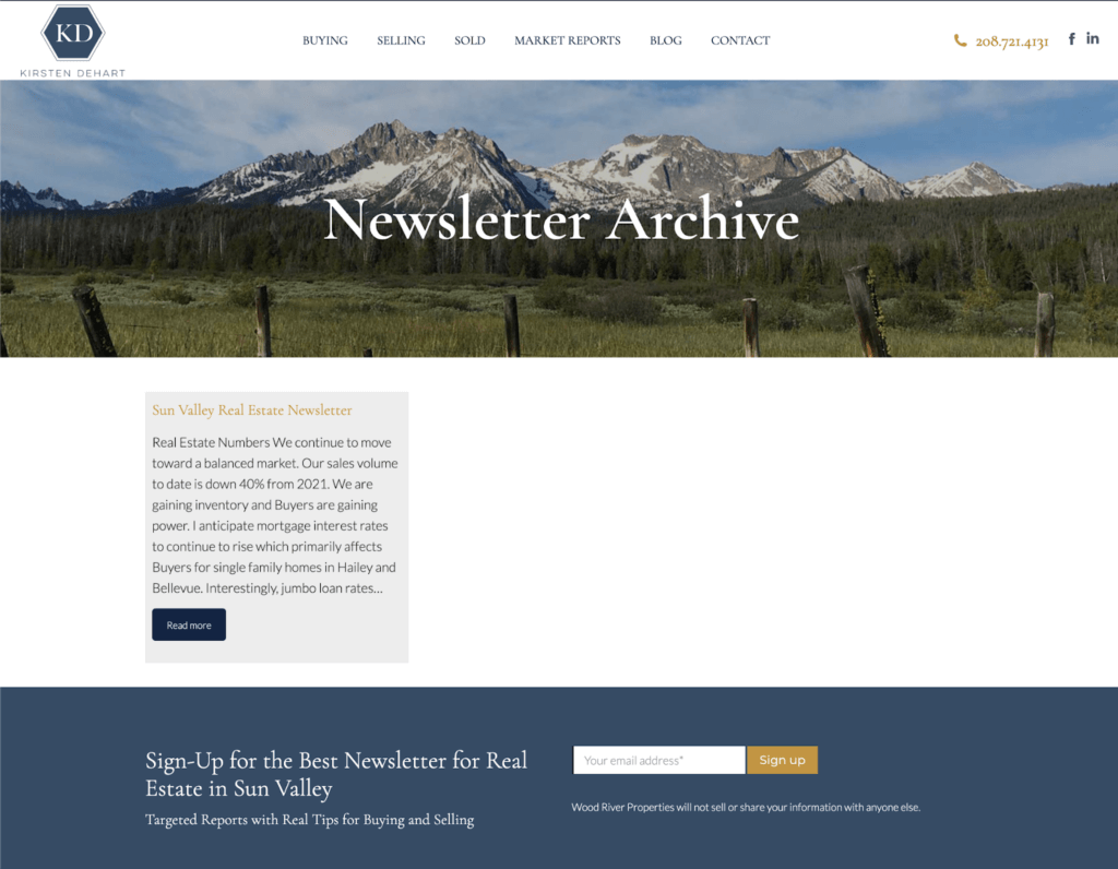
One of the features of Newsletter Glue is that you can have your newsletter archive on your site, just like your blog archive. This makes it easy for potential subscribers to browse your newsletter and decide if they want to sign up. It also means your newsletter is SEO friendly.
The difficulty of setting this up highly depends on your technical ability and the customisation features of your theme. For some themes, this is set up automatically.
In our case, we had to learn how to create the newsletter archive using WPBakery (which was installed with the theme), which was much easier than expected.
We then added the newsletter archive to her footer so that it’s easily accessible to anyone interested.
Step 5. Handover
This was done in two calls.
In the first call, we covered the newsletter audit, newsletter design and work in progress on her site. This allowed us to share the general direction of our work and give advice on improving her newsletters going forward. This included a slide deck for the newsletter audit which she could review and implement in her own time.
In the second call, we gave Kirsten a step-by-step tutorial on how to use her new newsletter template to write her newsletters. We also showed her how to customise her template in the future or create new ones if she wanted. This was all documented in a Google doc with screenshots so she could easily refer to it at any time.
Once everything was complete, we shared with her links to all the docs we created. And with that, the job was done!
Results
Working with us
It’s been great to work with Newsletter Glue. You’ve been very responsive, listened to what we need and created a template that works for us.
Kirsten DeHart, Owner of Wood River Properties
Gaining consistency in publishing newsletters
Here’s what Kirsten has to say about publishing newsletters before and after Newsletter Glue:
Before Newsletter Glue, my template, content and even publishing schedule were inconsistent. In particular, it was very tough to share listings and market data, I would build the images from scratch each time.
With Newsletter Glue, it’s much easier to publish, so everything is more consistent now. I just go to my template and update my content for that newsletter issue. It’s a very simple and streamlined process.
Kirsten DeHart, Owner of Wood River Properties
Halved publishing time
After successfully implementing Newsletter Glue, Wood River Properties was able to cut its newsletter creation time in half, leading to an average time-saving of one hour per newsletter. Kirsten especially liked the post embed block which allows her to easily add beautifully formatted new listings in a matter of seconds.
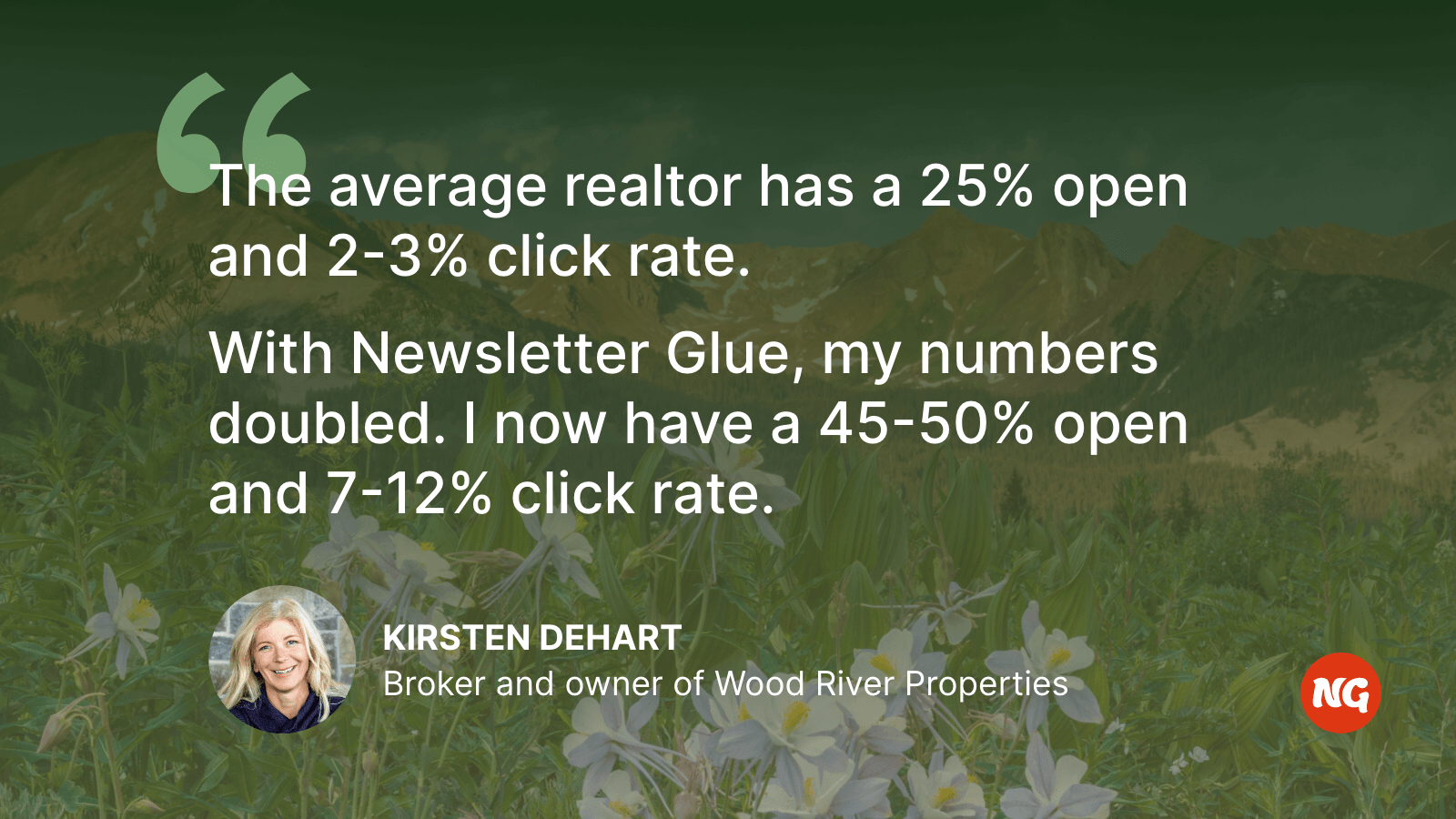
Doubled click-throughs and open rates
The most significant outcome of using Newsletter Glue was the remarkable improvement in Wood River Properties’ open and click rates. Their open rate jumped from 15-20% to an astonishing 40-50%. Similarly, the click-through rates doubled and now range between 7-12% as opposed to the pre-Newsletter Glue rate of 4-7%.