
After months of work, I’m proud and excited to introduce you to our new site. As a tiny bootstrapped company of two, finding the time to work on this was hard. And it took significantly longer than anticipated; 4 months, to be exact. I started rebuilding our site on Aug 2. I know because that’s what I named the doc, “Website refresh Aug 2”.
A third of a year for a new site seems like a very long time, but the reality is that this was much more than a new coat of paint. Here’s the story of why and how I built the new site.

The old site was positioned the old way
We started building Newsletter Glue in August 2020. I threw together a founder’s letter-style landing page, we submitted the plugin to the repo and with that, we launched!
After gaining a bit of traction quickly, we realised we had a good opportunity on our hands and in November 2020, we launched the paid plugin along with our first full website.
At the time, I thought our target market would be creators. People looking for a Substack alternative on WordPress. So I designed the site with that audience in mind.
It was, at the time, the nicest site I’d ever designed. I’m not a designer by trade, so everything you saw there was the result of me pushing my design skills to the limit. I posted screenshots along the way, asked for lots of feedback and received excellent advice from people in and out of the WordPress community.
Here’s a thread of some of my design exploration from the old site:
As the business grew, we outgrew our original positioning
As I mentioned, the original plan was to target creators and indie newsletter writers, kinda like Substack.
But a year in and hundreds of customer conversations later, it turns out our best customers are professional bloggers/publications, local newsrooms and paid newsletters. That is, people who are serious about newsletters. Our old creator-oriented site with it’s hand drawn illustrations was starting to feel at odds with this group of people.
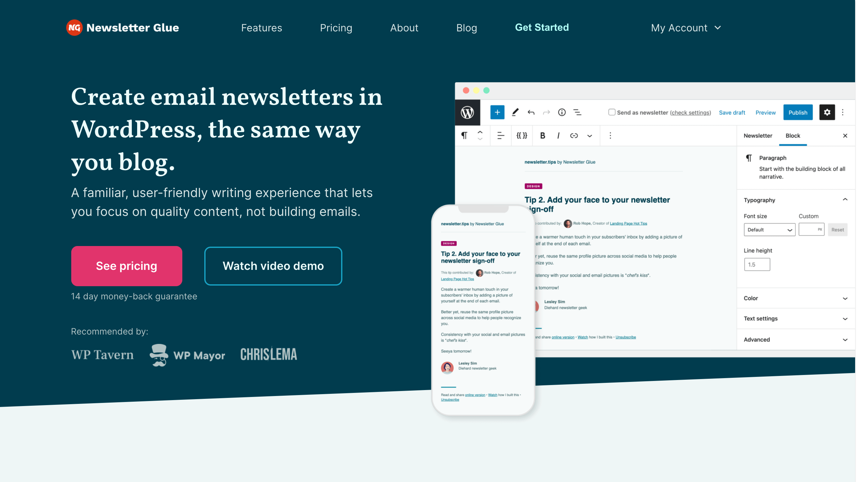
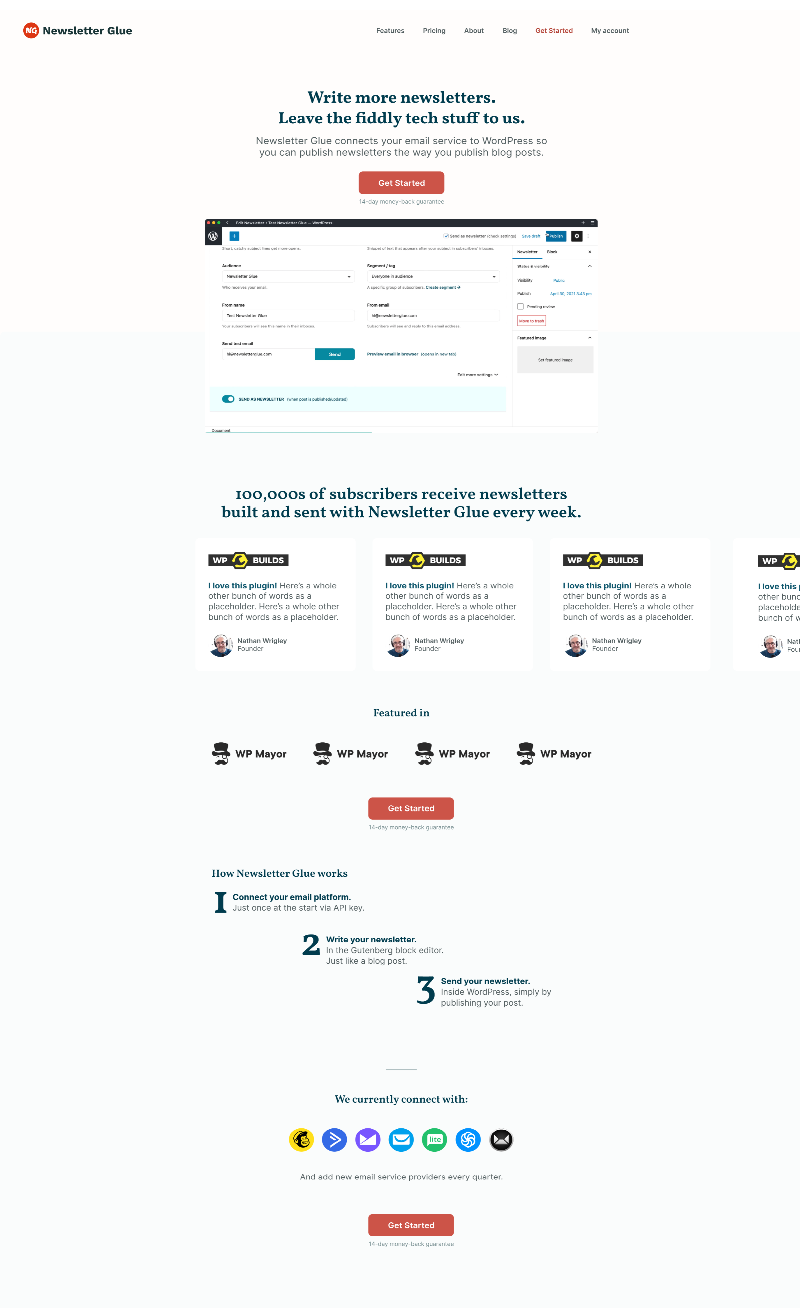
I also learnt what our customers loved most about us. It turns out, people like the convenience of writing newsletters in WordPress. The block editor is familiar and easy to use, yet full of powerful features. We also made it simple to build pattern templates. This matters a lot when many of our customers employ a team of writers and editors who need to write, edit and approve newsletters on a deadline. WordPress has user roles built in, which makes collaboration straightforward. Mailchimp? Not so much.
I learnt we save customers, on average, an hour per newsletter. The time saved, combined with the ease of writing increases consistency and quality – The two biggest hurdles for all newsletter writers.
We even have a number of people who’ve said they’ve started writing newsletters again and have managed to stay consistent simply because we’ve made it so easy for them.
Because it took time to learn these insights, the old site didn’t reflect any of these newly discovered value propositions.
Higher trust is needed to switch email publishers
I like to think I’ve done a fairly good job in getting the word out there about our plugin. But people need a lot of convincing before switching the way they build emails.
“I don’t have time to switch. I don’t love my current workflow, but at least it works.”
“They’re new, so who knows if they’ll last? I’m not going to switch only for them to shut down a year later.”
“What if they stop maintaining the plugin? I don’t want to rely on something that will break after awhile.”
“I finally got my email templates to work in Outlook. I’m not going to switch to a new email builder, which might have broken or bloated code.”
“If people unsubscribe because of broken emails, I can’t get them back.”
“I like what they’re doing, but I’ll wait and see before switching.”
When we were just starting out, those objections were understandable. I too would be very careful about trusting a new plugin with my emails. After all, it takes awhile to get used to a new workflow and once an email is published, you can’t take it back!
I no longer think those concerns are justified (of course, I’m biased 😉). In the past year, we’ve spent incredible effort making sure our email html is lightweight and optimised. Our templates have been tested to death on Litmus and Testi by ourselves and our customers. We’ve reduced our email code size by 80% in February 2021, then by 60% a second time in May.
However, new customers aren’t going to know all that, unless we tell them…
Investing in a new website shows our commitment.
The website refresh indicates we are doubling down, not fading away.
The new positioning shows our business is growing, we’re listening to our customers and reflecting their opinions in our roadmap and website copy.
The highlighted testimonials demonstrates the trust our customers have in us, along with our ease of use, the robustness of our email code, and our helpful support.
With this undertaking, we’re signalling that we’re serious and you can trust us with your email publishing.
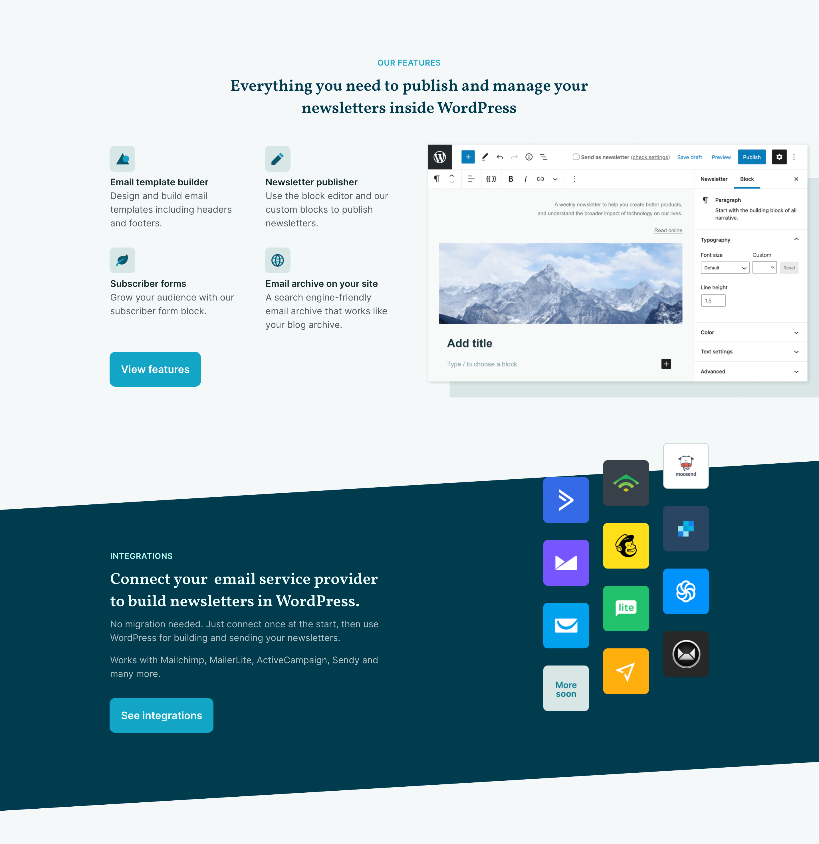
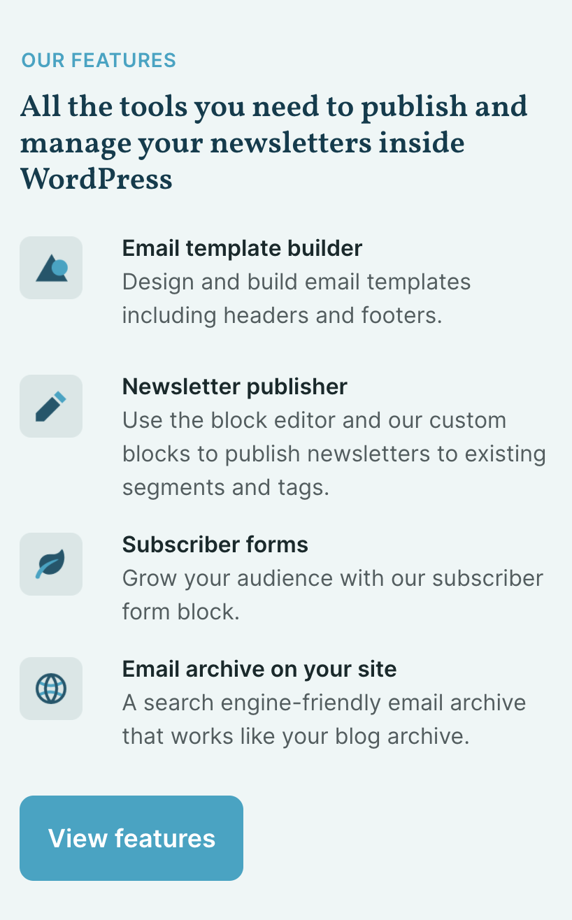
Use videos to showcase features
Having done dozens of livestreams, presentations and podcasts, I knew that demo-ing Newsletter Glue is the best way to explain its value and convert new customers.
I like to think of us as an email publishing platform built on WordPress. But that’s just fancy jargon that means very little to actual customers.
Hence, show, don’t tell. Our new website, specifically our features page, now has many more videos which do the heavy lifting of explaining our value to new site visitors.
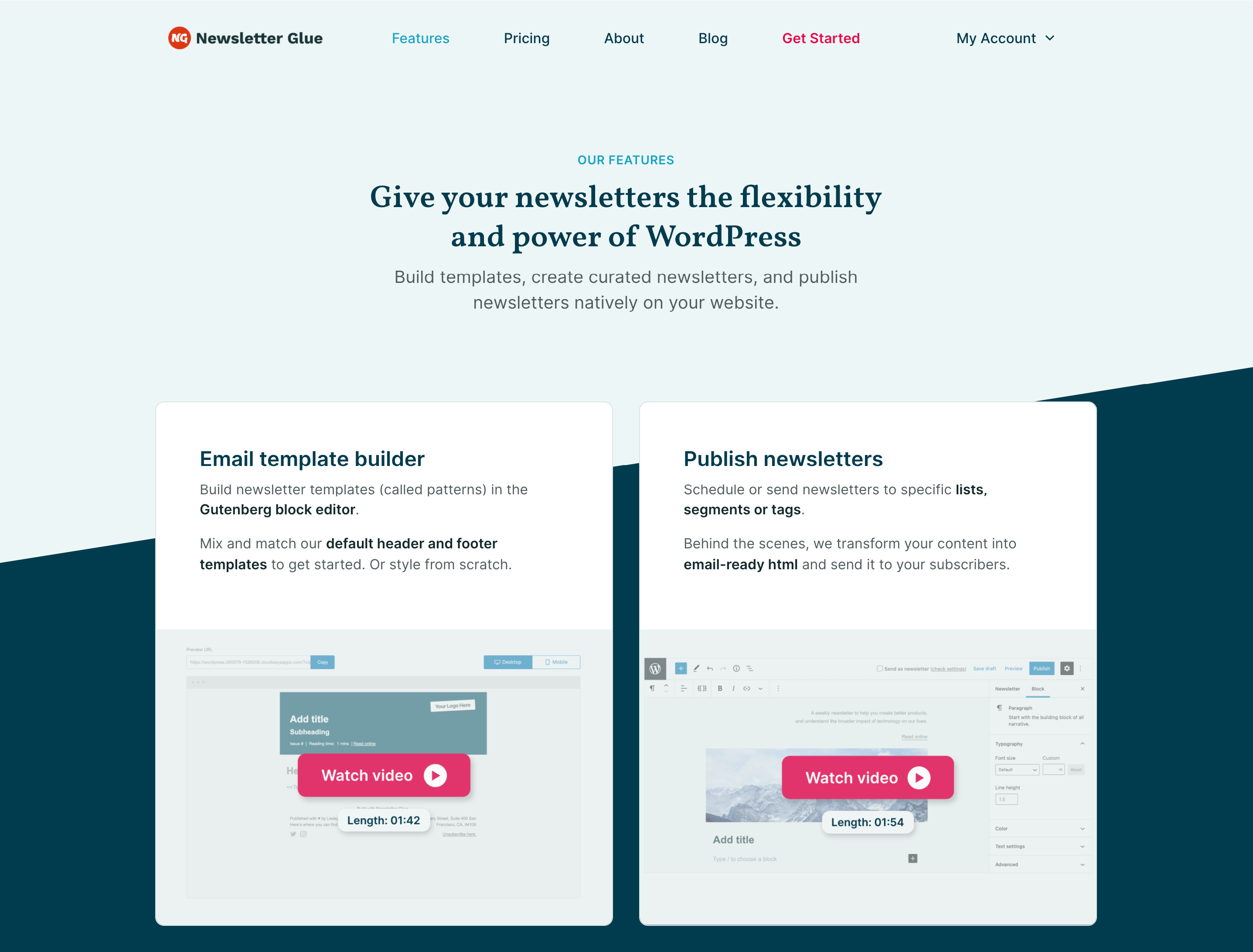
As an amateur video maker, this was a painstaking effort as I wanted each video to be as short and value-packed as possible. There are now 5 detailed videos on the features page which give you a good idea of our features. Yet it only takes 10 minutes to watch them all.
On top of that, I also reframed our features and rewrote all the copy. As a founder, turning individual bits and pieces into coherent jobs-based features was really tough. The old features page was just a list of blocks we built, and very much missed the forest for the trees. I had to reimagine this page from scratch in order to highlight our true value.
Education will continue to play a big part in our marketing strategy going forward. There’s still a lot to be done here but I’m glad to have laid the foundation.
Behind the scenes – Building the new site
I mentioned earlier that the original Newsletter Glue site was the best one I’d ever designed. The same goes for this new design.
Improving my web and product design skills has been my favourite part of the Newsletter Glue journey so far. I’ve learnt and grown a lot.
I think it’s always helpful to see first drafts so people know brilliant designs do not emerge, fully formed, on day one. Here’s one of the first drafts I made back in August. As you can see, I’ve made a lot of changes since then and the final site looks very different!
Here’s a quick list of difficulties I faced and breakthroughs I had:
Testimonials
Whew! This was the toughest part of the whole build and I procrastinated on it so much. It’s easy to chat with customers when they reach out for support or to request features. It’s not so easy to approach customers and ask for testimonials. Or to follow up with them when they ignore you. Or to suck it up when they say no (fortunately, no one did. But the fear remains).
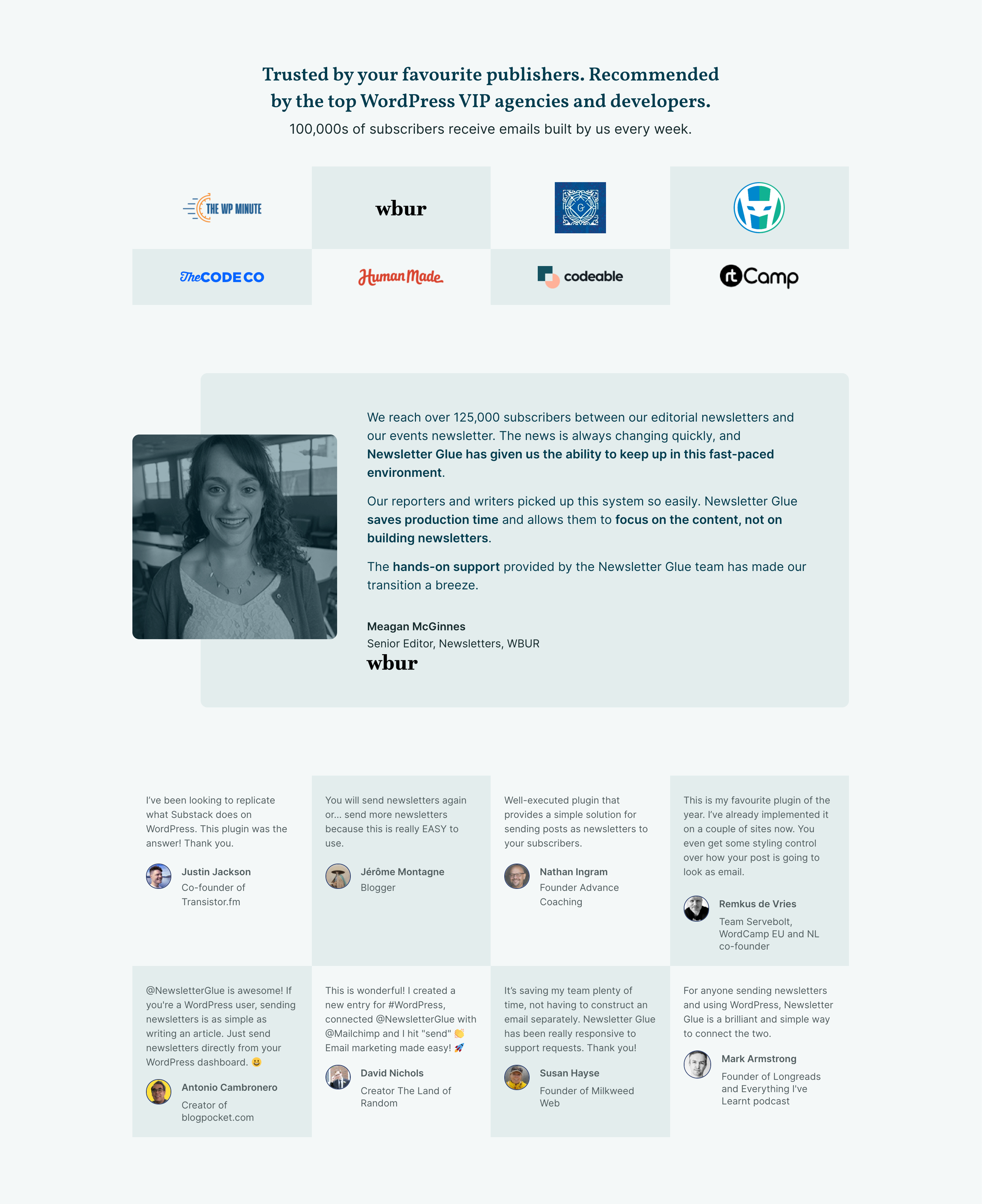
This is scary even when you’re only reaching out to friendly customers whom you already have relationships with. At the back of my mind, I always fear they’ll say, “no! Don’t feature me. In fact, I was just about to switch away from your product.”
It took me months to collect the handful testimonials I wanted. Just a combination of procrastination, back and forths, and approvals. This is a good example of things that seem easy on the surface but take a long time in reality.
The slash
The full width slash element is one of my favourite things about the new design. It was directly inspired by Stripe’s. That simple, recurring design element really brings together the site and makes my otherwise simple site more visually arresting.
Mobile design
I have my friend Bhavesh to thank for this. Together, we went through the site and he showed me where I could optimise the mobile design.
Before him, I had stacked the icons on top of the words, rather than on the left. This took up a lot more vertical space, which isn’t ideal for mobile as it means a visitor has to scroll just to read our features.
Mobile design optimisation is all about making use of the space you have to minimise scrolling and maximise communication.
The tech
This is controversial, and I’m sure people have o p i n i o n s, but I built the whole site using Thrive. I’ve used it for many years and it’s the page builder I’m most familiar with. This project already took me months, so I simply couldn’t afford to add even more months by building from scratch in Gutenberg.
I looked deeply at some of the top Gutenberg themes out there (I really like GeneratePress and Blocksy), but they all needed some code to get the site to look exactly how I want and I just didn’t want to wrestle with that. I know I’ll be changing the site a lot in the coming months and don’t want to code every single time. I’m not a developer, so this would take me a lot of time, or require Ahmed to step in. It’s simply not the best use of our time.
Launch troubles with EDD
I built the whole site on a staging site and planned to “simply” push the staged site live when I was ready. How naive of me!
In reality, it took about 30-40 hours of investigating, troubleshooting, planning, and manual export-import.
The problem was with Easy Digital Downloads, the software we use to sell and manage plugin licenses. It stores all our customer transactions and records inside wp_posts and comments. Simply put, the code for our store was enmeshed with the code for the site design.
Note: EDD v.3 , which is currently in beta, fixes this issue.
If I pushed the staging site code to the live site, it would erase months of customer data. Yikes!
After hours of hunting for a solution and trying to build one, we gave up. Frustratingly, we realised the only way to deal with this was to manually import the site page by page. This was confirmed with other EDD customers I chatted with who admitted they did the same.
I was super unwilling to go down this path particularly because I used a page builder. Exporting then importing code built with a page builder introduces a million tiny bugs because the two sites are never identical (even in my case with the staging site).
But that’s what we ended up doing.
I created a monster checklist, put up an “under construction” page for a few hours, manually imported every single page and fixed every bug I could find.
I am so glad to be done.
Hard won tips for redesigning your site
Having just been through this ordeal, I wanted to share some advice for other founders thinking about redesigning their website:
- The only good reasons for redesigning your site is if the old one is very unprofessional or not attracting the right customers (e.g. too corporate for consumers or vice versa).
- 70% of your effort should be on the content of the site, not on the design itself.
- If we’re talking about a full site redesign, put it off for as long as possible. But once you commit, you have to go all in. You can’t half-ass a site redesign because that significantly lowers its chances of launching or puts it at risk of looking like a half-old-half-new frankenstein.
- If you can’t commit, just keep adding or updating sections in your existing site, rather than building a new one from scratch.
- Plan every aspect. The part you gloss over or think you’ll get to later is probably going to be the part that trips you up. In my case, it was the actual site launch.
- Break your grand vision into milestones or phases. I originally had grand plans for the redesign but realised I’d never launch if I tried to do everything I had in mind. Instead, I down-scoped and got phase 1 out the door.
Looking ahead
We still have a long way to go. As I alluded to above, this is only phase 1 of 3 in our site redesign. In upcoming phases, I’ll be building a Quick start guide, adding case studies and revamping our Account and Affiliates page.
What’s next for the plugin?
The site redesign is only a tiny part of all the things we’re working on. We’ve also been hard at work developing v.2 of the plugin which updates our admin settings to use React and Gutenberg components. This sets the stage for many exciting new features to be built on top of it.
I can’t share too much about our planned features right now, but what I can say is that one of our big themes for next year is integrating plugins, not just email service providers.
Your feedback is welcome!
All site launches are hectic, chaotic affairs. Things will break. If you’re visiting our site and notice something broken, please let me know. I’d really appreciate it.
