
Post Status is a member-supported community for WordPress professionals. I’ve been a member for several years now and have benefited tremendously from the relationships I’ve built inside Post Status, and the opinions and discussions shared within its vibrant Slack channel.
Needless to say, when I got the opportunity to redesign their newsletter, I was really excited. I read the newsletter every week and while I enjoy the content, I have personally found it a bit hard to follow at times due to its length and structure.
It’s worth noting that the original plan was to move the Post Status newsletter on to Newsletter Glue. However, due to some complications with the existing site set up, we eventually decided to prioritize the redesign, and get started on that first.
We kicked off the project with a call between Cory, Dan, and I. They shared some of the problems they’ve encountered with the newsletter and their must-haves for the new design.
Here’s the brief
A better way to categorize and structure content
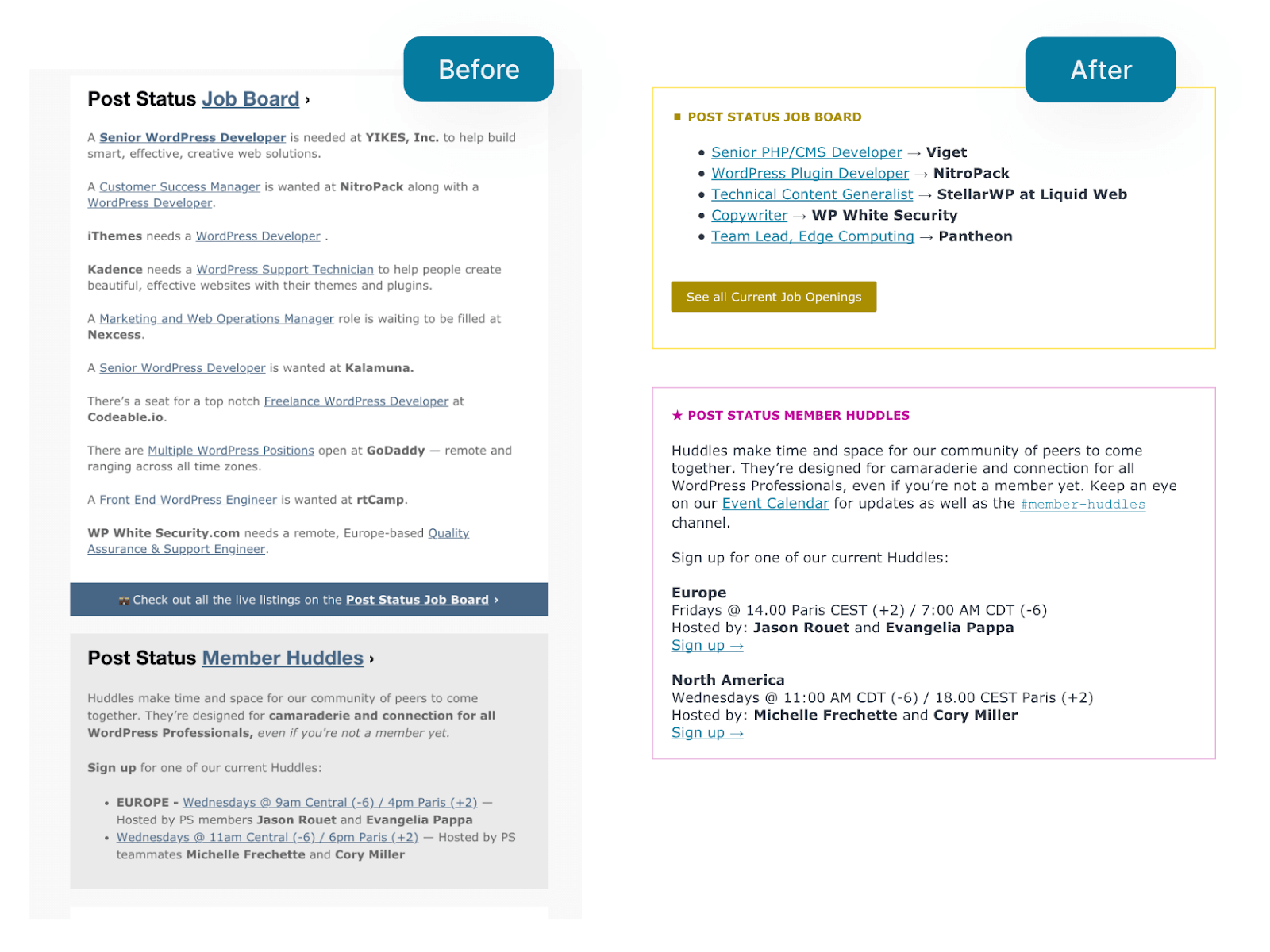
Post Status curates news from a tremendous number of news sources. It’s hard to decide what goes where, and help readers make sense of it all.
Cory and Dan had already started to categorize their curated content into four key buckets or beats that different contributing editors each take responsibility for: Tech, Business, Career, and Community. So part of the brief was to design the newsletter to help them easily differentiate one bucket from the next.
While most newsletter redesigns are intended to improve readability for subscribers, this redesign also needed to help the editors. Dan and Cory wanted more structure to help them edit, curate, and build the newsletter each week.
A unified design system
The newsletter has been around for many years. Over time, they’ve added new sections and amended old ones without a design system to hold it all together. This led to several different sections having their own unique style, separate from the rest of the newsletter.
The new design needed to look at all the different sections from a bird’s eye view and come up with a flexible system that would work for every part of the newsletter. Flexibility is key because the newsletter is constantly evolving, with new sections being added and old ones retired over time.
Reduce Gmail clipping
Gmail notoriously clips emails that are bigger than 102kb, give or take. The Post Status newsletter is very long because there’s so much WordPress news each week. We needed to find a way to slim down the newsletter and code as much as possible.
With the brief in hand, I was immediately inspired. During the video call itself, I mocked up some designs for Cory and Dan, and they were excited. With their green light, I refined the initial idea a bit more and shared some options with them.
After some back and forth, we arrived at a design we were all happy with, and we proceeded to build the email template.
Here are some highlights from the final design.
Highlights of the new design
For the new design, I broke down the entire newsletter into three key sections:
- Primary news section
- Secondary events and careers section
- Before you go and footer section
I applied email design best practices and the requirements from the brief to each section, while making sure everything still fit together as one coherent design. Importantly, I tried to keep things as simple as possible to ensure it’d be viewable across most email clients.
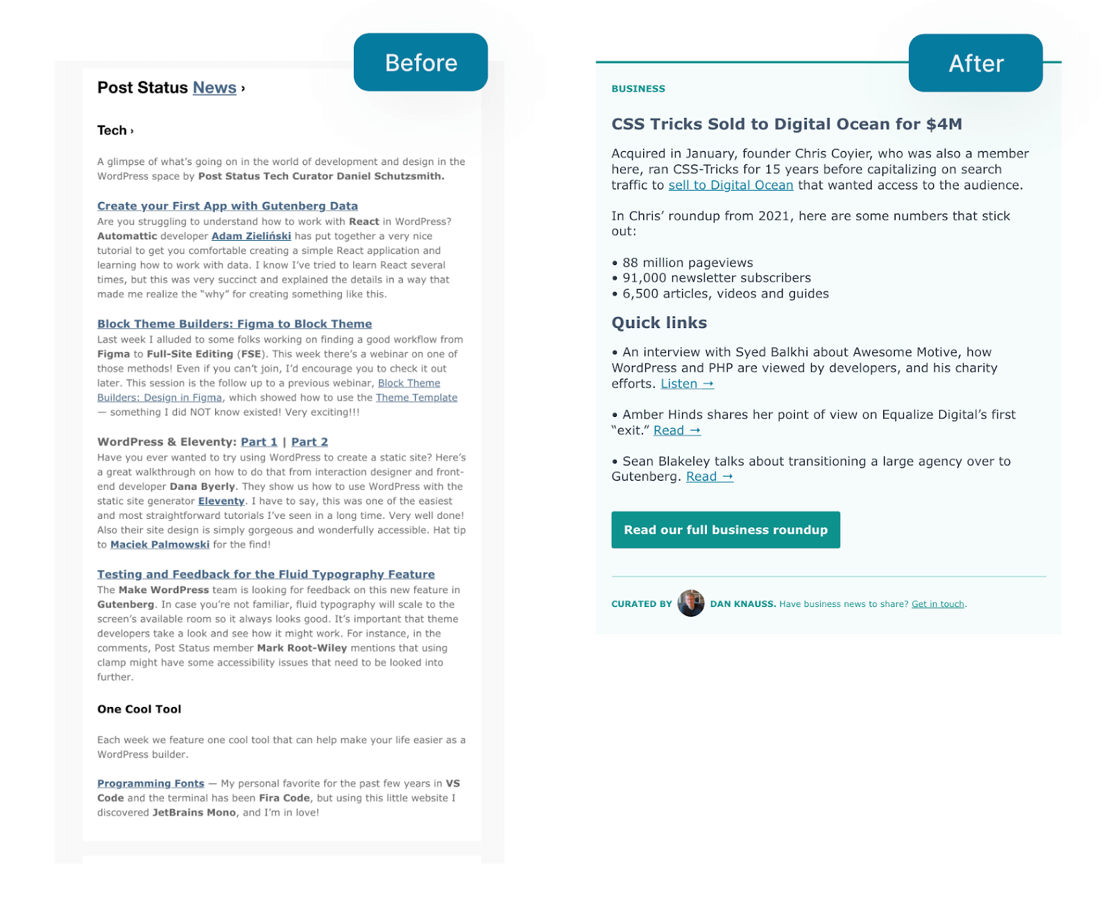
A more skimmable primary news section
The primary section of the newsletter consists of Post Status’s four key news buckets. This makes up the bulk of the newsletter, and can sometimes get a bit dense and word-heavy. To solve this, I prioritised skimmability so that readers can easily find and skip to the news they’re most interested in. Clipping was also a concern, so I explored ways to reduce content, and by extension email size, while still managing to showcase many articles.
I achieved this in a few different ways by:
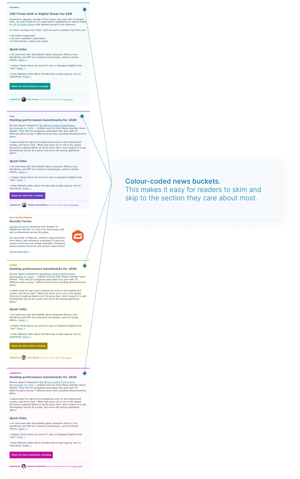
- Creating color-coded buckets for easy skimming and recognition.
- Adding tags to the top of each bucket so users immediately know what each bucket is about. I made these changes small and subtle since the tags are just there for wayfinding. They should not draw attention away from the main news headline inside the section.
- Adding Quick links and a Read more button to prevent clipping. Instead of the previous long form paragraphs, we try to limit the long form areas to one or two key pieces of news, while placing the rest of the articles under the quick links section. This significantly reduces the amount of content, and thus the email size in kB.
Breakdown of each news bucket
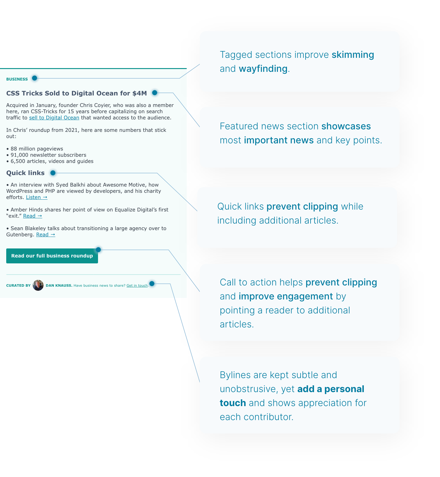

Comment from Dan: I like the introduction of the contributing editors’ bylines, photos, and contact links. We’ve never had a good way to personalize subsections and pieces of content that are easy to understand.
Bird’s eye view of the new primary news section
Before and after of the primary news section
Surfacing key details for the secondary section
Aside from the primary news section, the Post Status newsletter has many other secondary sections that needed their own design.
These secondary sections do not contain long form news. They’re events, job listings, and other actionable items for subscribers.
Building upon the color system we established for the primary news section, we created a secondary design but this time with outlined containers. This concept is similar to button design – where primary buttons tend to be fully coloured, and secondary buttons are simply outlined.
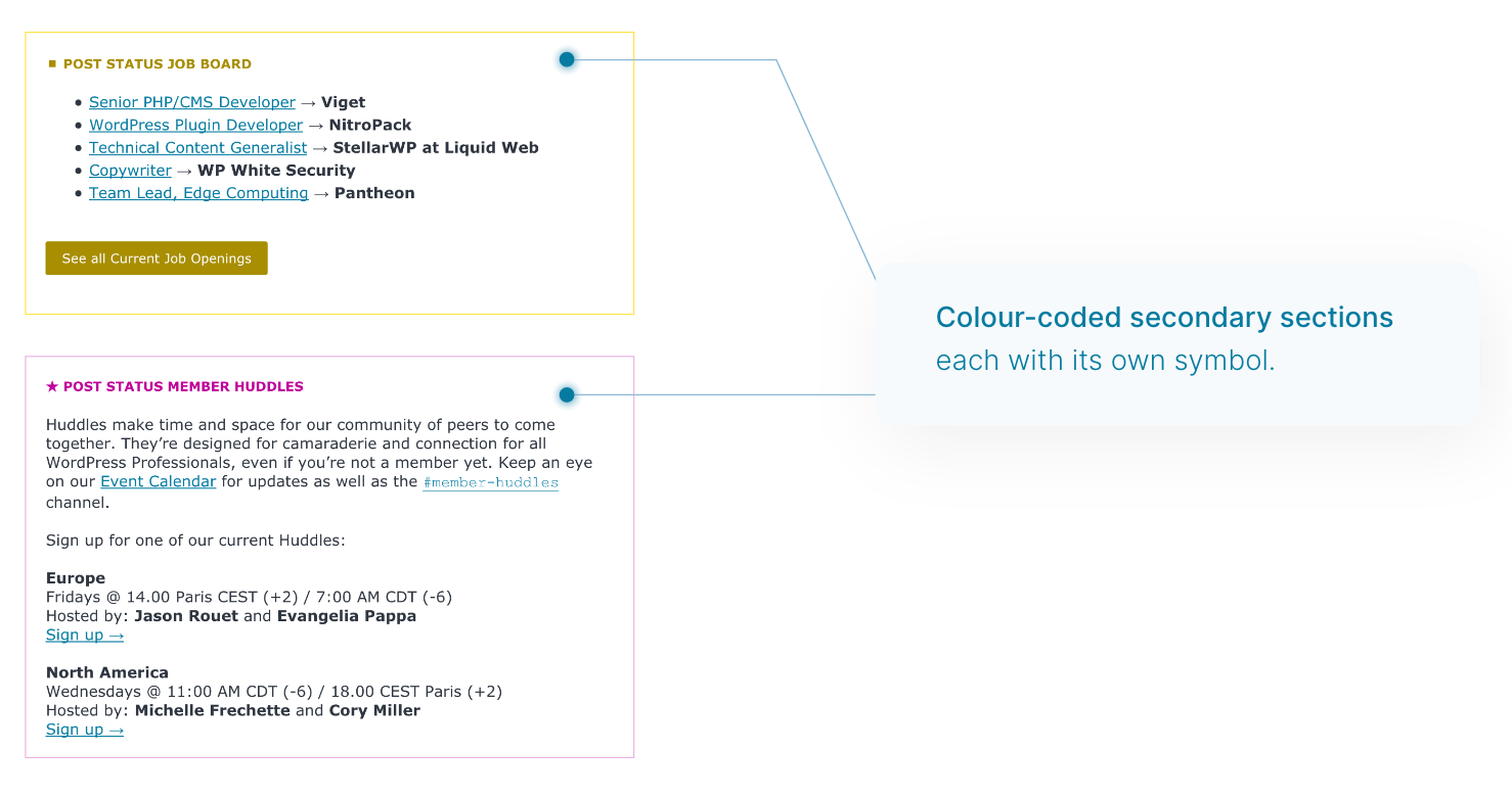
Because these sections are more events and career-oriented (apply for job, sign up for member huddle), I made sure to reduce unnecessary text and make it point-form wherever possible. So that the key details and calls to action are easy to find, even while skimming.
Taking action with the Before you go and footer section
Finally, my favourite thing to optimize is the last part of the newsletter. This is your final chance to convert subscribers and get them to engage with you further.
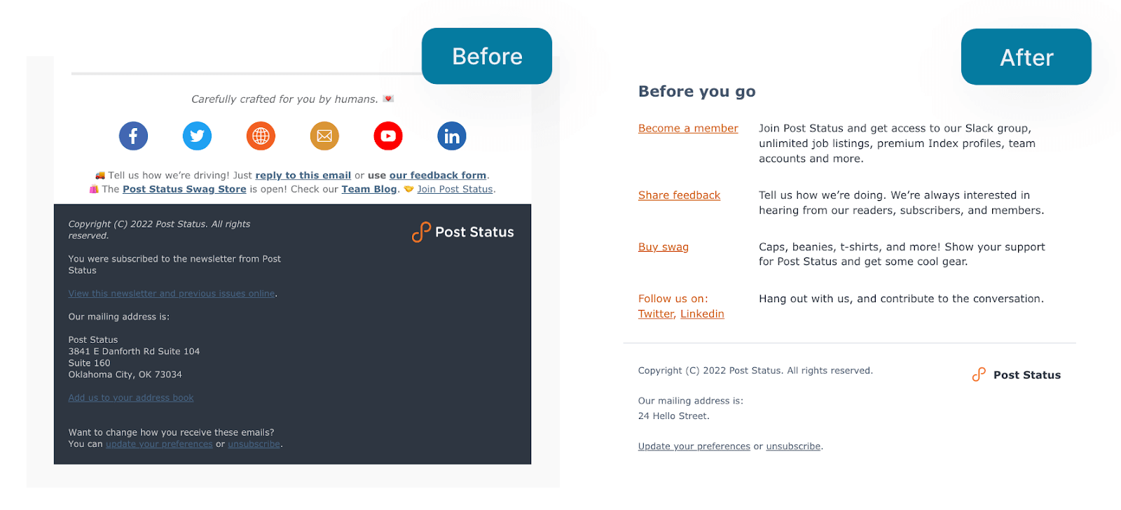
Most people use default designs from their email service providers (like Mailchimp) which tend to be over-designed, heavy, and distracting. Worse still, they look generic, like everyone else’s newsletter.
In this case, I took all the separate generic blocks, extracted the key calls to action, and transformed them into a clean and clear Before you go section.
This way, subscribers can easily see a list of suggested actions they can take if they’ve enjoyed the newsletter.
Final thoughts
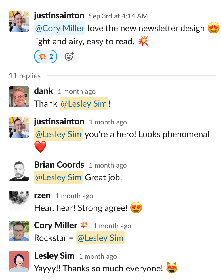
I really enjoyed working on this. It was nerve-wracking to see the first issue with the new design go out, but it was really well received by subscribers who loved how light, airy, and easy to read it is now.
All in all, the job took us about two weeks for the design, a week to build the template, and another 3-4 issues of playing with the design to make it feel right.
Results-wise, the most significant impact has been on the Before you go section. The Become a member and Bag swag clicks have gone up from virtually zero in the previous design, to a large handful each week.
Frankly, I would love to say the redesign resulted in significantly more clicks. But having looked at the numbers, it appears that clicks are mainly dependent on the piece of news. If it’s an article people are interested in, they’ll click it. If not, no amount of good design will change that.
Comment from Dan:
This is a good thing, because Post Status has always been known for calm, thoughtful, conversational, non-clickbaity, no-drama discourse in what we publish and the space for dialogue we maintain on Twitter and in Post Status Slack. If readers can find and choose what matters to them based on substance — not presentation in headlines and design elements — then we’re helping them be their best, not manipulating them to extract some attention-time.
The most important thing for me personally in this redesign touches an aspect of template design I’ve never seen discussed, which is how design influences the thinking and writing that goes into the final published product. Which is also to say it influences the people and processes in a publishing operation.
This is essential and obvious to anyone using publishing software to wrangle many writers using different voices and media types under a single brand that has its own tone and style. Software like WordPress and Mailchimp is supposed to separate content from presentation so content-focused people can focus exclusively on content. But the design, which should be shaped by your typical content, is also an influence on how you think, write, and produce your media content.
Because the presentation layer creates constraints for what will fit or be appropriate to a particular part of a layout, this not only standardizes content production (and sometimes frustrates us when exceptions arise), it habituates editors to how they must plan and relate different pieces of content. As a result of Lesley’s design, I now think more explicitly throughout the week about what main stories and headlines might go in a section and what might complement them nicely as secondary content.
We find something like “themed issues” starting to arise organically now, as the new design helps refine our high-level editorial processes. If all goes well, “putting an issue to bed” feels like we have encapsulated or given voice to one or two key currents on the WordPress community and business ecosystems. And if our understanding of the people, businesses, technologies, and topics of concern is clearer as a result, we can be confident our readers will also find a clearer signal.

Comment from Cory:
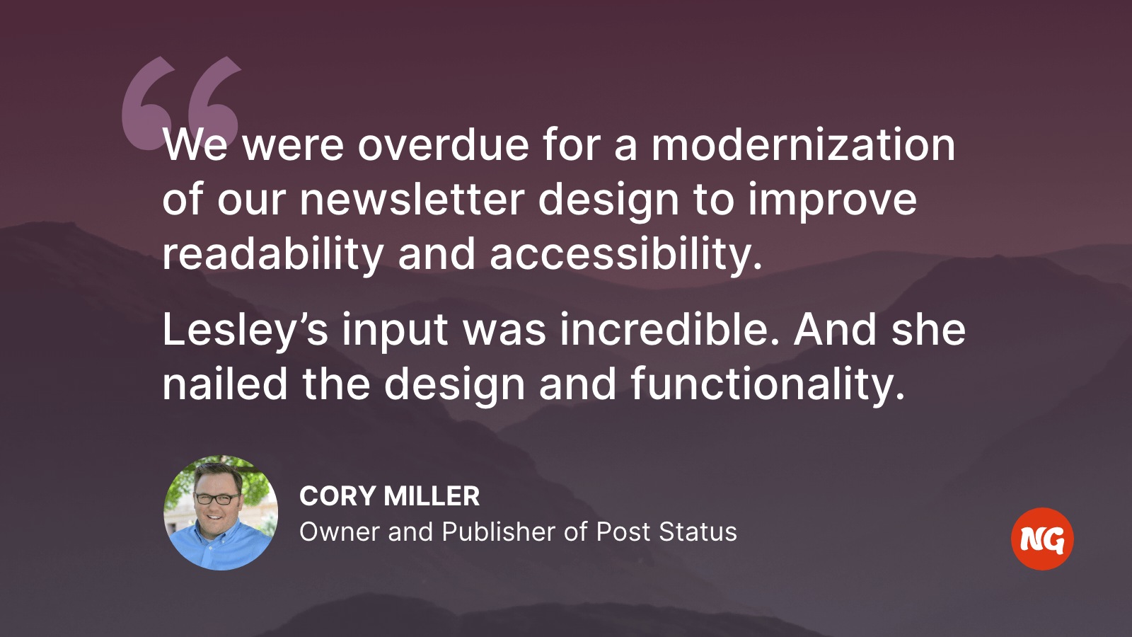
We were overdue for a modernization of our newsletter design for readability and accessibility. But as we have historically high open and click through rates, we wanted to take this opportunity to review what we offered our audience and a way to truly make it the “TL;DR of the Business of WordPress.”
Lesley’s input was incredible. And she nailed the design and functionality. As you’ve read above, she got what we were trying to accomplish by offering the color coded sections. We’ve taken this initial concept and iterated slightly to ensure we keep making this email our community’s most valuable and impactful of the week.