We’ve added some simple classes to style your newsletter using core Gutenberg blocks.
Important: These styling changes only affect your newsletter HTML. They will not show up on your website or blog. To style your site, you will have to make changes to your site’s theme.
Step 1. Adding CSS classes
To begin, you’ll have to add a CSS class to your block.
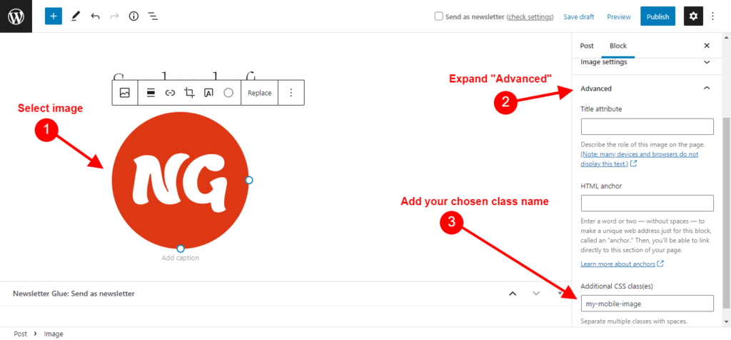
In this example, we’ll change the logo image size in mobile.

Here are the steps to add a CSS class to a block:
- Select the image.
- In the right hand toolbar, scroll all the way down until you see the Advanced section. Expand it.
- In the field labeled Additional CSS class(es), type in your chosen class name. You can give it any name you like.
Step 2. Add custom CSS in Global styles
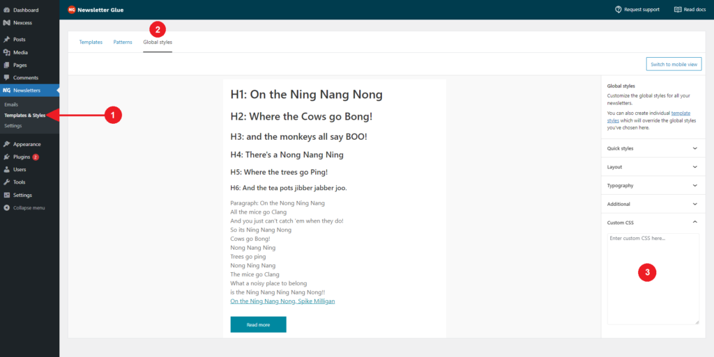
Next, we’re going to add your desired CSS into the global styles so that we can make the desired styling changes to your identified class.
Here are the steps:
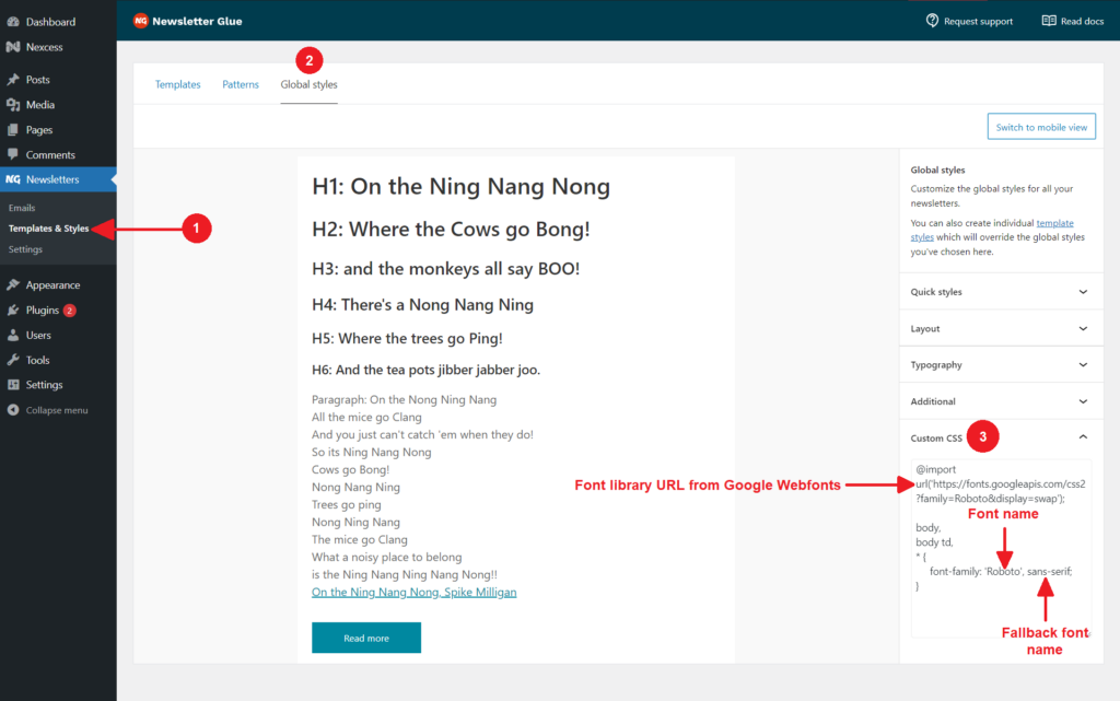
- Go to Newsletters > Templates & Styles.
- Then click on the Global styles tab.
- In the right hand toolbar, scroll all the way down until you see the Custom CSS section
- Add in your desired CSS here.
- In this example, we can use something like:
@media only screen and (max-width:650px) {
     #template_inner img.my-mobile-image {
          max-width: 100px !important;
     }
}
More ways to adjust styling of blocks in Newsletter Glue
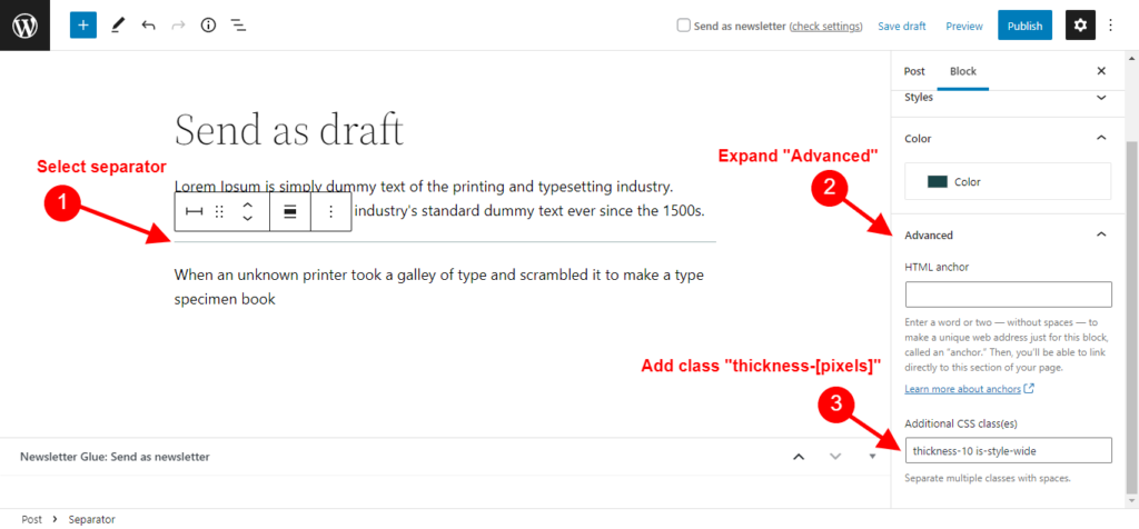
Adjust thickness of separator
To adjust the thickness of the Separator block, select the desired separator block and add custom css class “thickness-[pixel]” to the Advanced panel.
For example, if you want your separator to be 5 pixels thick, add “thickness-5“. If you want your separator to be 10 pixels thick, add “thickness-10“.
Keep image width
You can give the class ngl-keep-width to any image you want to keep its size even on mobile and not stretch to full-screen width.
This is a better approach than trying to set a custom class and width for each image separately.
Steps to use this feature are:
- Edit image block
- Add ngl-keep-width as a class inside Advanced CSS class name
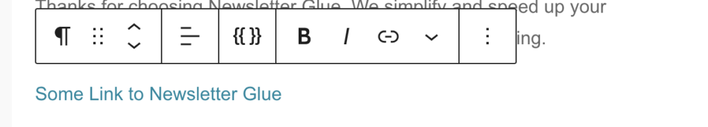
Custom Links Styling
You can style individual links on a newsletter by adding custom CSS classes.
Steps to set custom link styling.
Step 1
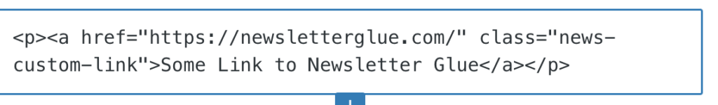
Edit the link as HTML, add a custom CSS class to the <p> tag or the <a href> tag.
Step 2
Save the Newsletter post.
Step 3
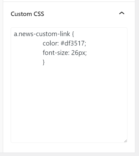
Navigate to the custom CSS page, and add styling using the custom CSS class you have added to the link.
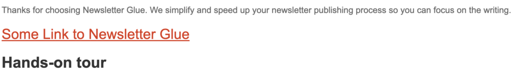
Result in Email
Add your own fonts
You can now add custom fonts to your email template by adding the following code into the custom css. Be sure to add fallbacks though, as most email clients only recognise basic fonts (e.g. the ones we include in the theme editor).
@import url('https://fonts.googleapis.com/css2?family=Roboto&display=swap');

body,
body td,
* {
     font-family: 'Roboto', sans-serif;
}
Web fonts aren’t 100% compatible across all email clients.
Generally, the following email clients have good support for web fonts:
- iOS Mail
- Apple Mail
- Android (default mail client, not Gmail app)
- Outlook 2000
- Outlook.com app
- Thunderbird
Learn more about using CSS classes in Newsletter Glue here.
Remove top padding from blocks
If you want to remove the 10px padding from the top of your newsletter. For example, if you have a container or image header that should be flush at the top. Here’s how you can do it:
Select your block, then give it a class name. In this screenshot example, the class name is “my-mobile-image”.
Then, head to Templates & Styles > Global Styles > Custom CSS and add this code:
table.my-mobile-image td { padding-top: 0 !important; }
Replace “my-mobile-image” with whatever class name you have given to your block.
Change mobile header size in post embed block
To manually change the mobile header size in the post embed block, please use this code:
@media only screen and (max-width: 642px) {
.ngl-article-mobile .ngl-article-title a span {
font-size: 14px !important;
}
}
Change 14px to your preferred size.
Add fonts for specific classes
To specify fonts for specific blocks, please use this code:
.my-custom-button a.wp-block-button__link,

.my-custom-button a.wp-block-button__link span {

font-family: Georgia !important;

}