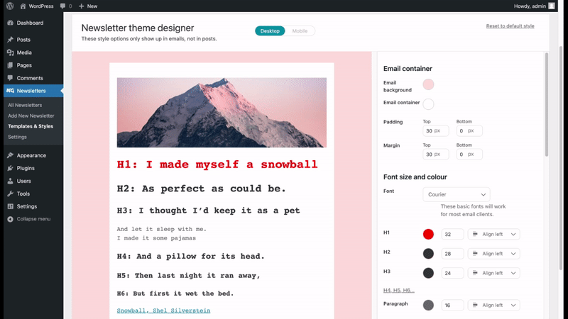
Find Newsletter Theme Designer by going to Newsletters > Templates & Styles then clicking on the Theme Designer tab.
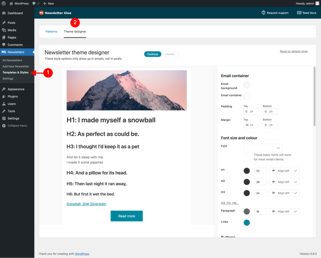
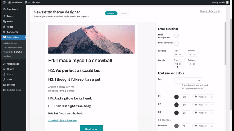
Here, you’ll see a demo email newsletter on the left, and design options on the right. Any changes you make to the options on the right will immediately be saved and shown on the left.

Additional notes:
- Any changes you make to the options here will only show up in emails. They will not show up in your blog post.
- The image you see here is a demo image. It shows you the position of your header image. If you disable your header image, you won’t see an image here.
Best practices
- Keep your colour choices to a minimum.
- Choose one colour for all headers.
- Choose one colour for your links and buttons.
- Make sure there’s lots of contrast between your text and your email background, so that your emails are easy to read.
Toggle desktop/mobile
Many people read emails on their phones. So we created a simple toggle to make it easy for you to optimise your newsletter for mobile too. Mobile options are focused on spacing and sizing. Colours and fonts are the same across desktop and mobile to give you consistent branding across all screen sizes.
Reset to default style
Don’t like the options you’ve chosen? Easily reset to the default style.