
Are you looking for the best newsletter fonts?
Your choice of email newsletter font will affect how easy it is for people to read your newsletter. It will also affect the overall look and feel of your newsletter.
Before we go further, the most important thing you should know before selecting fonts for your email newsletter is that not all fonts will load properly for your subscribers.
Fonts that work across all email clients are called web safe fonts. All other fonts available online are called web fonts.
Let’s dig in and find out what each of these are.
Web safe fonts versus Web fonts for email
Web safe fonts
Web safe fonts are fonts that all computers have pre-installed. As a result, most email clients have no issue reading these fonts. These fonts are:
- Arial
- Helvetica
- Verdana
- Georgia
- Times New Roman
The downside of these fonts are that they are very commonly used, which makes it harder for your newsletter to stand out. The upside is that you will never have to worry if your fonts or text are breaking in your subscribers’ inboxes.
Web fonts
Web fonts, on the other hand, are fonts loaded from a server (for example, Google Fonts). Using web fonts means you have access to an unlimited number of fonts, and you can use your brand fonts.
Unfortunately, they can be very tricky to code, will make your emails load slower, and are dependent on an external server to load. It is not uncommon for these fonts to break in certain email clients and you might have to spend time debugging your code.
If you’d like to learn more about how you can use web fonts in your emails, you can refer to these 2 resources we’ve personally read and found useful:
Using Web Fonts in Email by Campaign Monitor
Web Fonts: How to Make Them Work Perfectly in Email by Litmus
Our recommendation for newsletter fonts
If you don’t want the hassle of messing with code, you should opt for web safe fonts. You should only explore custom web fonts if you’re an email developer, or have hired one to build your emails for you.
For the rest of this article, we’ll focus on the basics of web safe font selection and also provide some additional tips to look out for when choosing a font.
Types of font typeface used in newsletter
There are primarily two font typeface categories that are commonly used in newsletters.
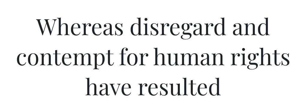
Serif typefaces: Serif fonts have a small tail at the end of each letter, giving them a classical look. Examples of serif fonts include Times New Roman, Georgia, and Courier.
Serifs work best for: Giving a classical newspaper look or professional feel to your newsletter.
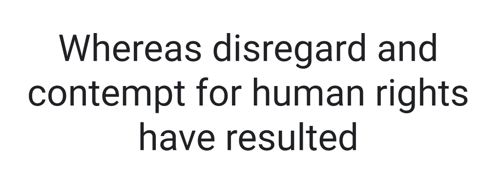
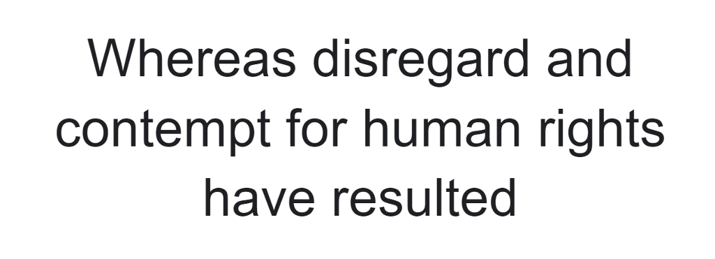
Sans-serif typefaces: “Sans” means “without,” and therefore sans-serif fonts lack tails at the end and are made up of simple, clean lines. Examples of sans-serif fonts include Arial, Roboto, and Open Sans.
Sans-serifs work best for: A modern feeling newsletter that’s cleaner to read.
You can also combine serif and sans serif fonts in the headline and body copy. For example, you could use a serif font for your headline to make it stand out, and a sans serif font to make the body look cleaner, modern and easier to read.
Best newsletter fonts for easy reading
Newsletter fonts are broadly categorized as web-safe fonts and web fonts. Let’s first take a look at some of the best web-safe newsletter fonts that are both readable and load on all types of device.
We’ll also look at some web fonts that give more design freedom and make your newsletter stand out.
Web-safe fonts
These fonts are safe to use on all devices and email clients. They should be your first choice when designing a newsletter.
1. Arial
Arial is a sans-serif font that is widely used in Microsoft Windows applications. It is a clean and simple font that is easy to read, even at small sizes. It is compatible with all email clients, making it ideal for use in newsletters.
However, its popularity also means that it is overused, so avoid using it if you want your newsletter to stand out.
2. Times New Roman
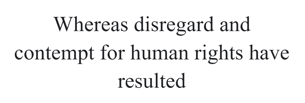
Times New Roman needs no introduction, as it is one of the most famous fonts in history. The British newspaper, The Times, designed this font style.
It is considered authoritative and classic, which makes it ideal for headlines, subheadings, and the body.
3. Helvetica
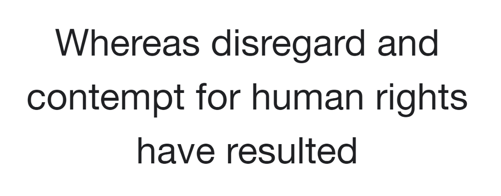
Helvetica is a sans-serif font that is known for its clean and modern design. It is widely used in corporate branding and marketing materials.
Due to its uniformity and lack of consistent spacing, it is only recommended to use in headings and subheadings.
4. Georgia
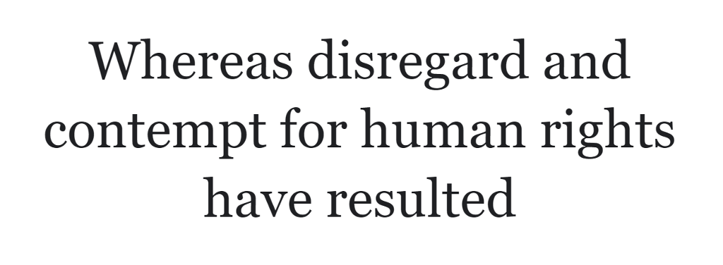
Georgia is another serif font that has a classic design with largely-spaced letters. It is fully compatible with all email clients.
You can use it for body text as it is very easy on the eyes and looks good.
5. Verdana
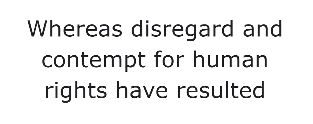
Verdana is an excellent font with well-spaced letters that improve legibility. It looks modern and is ideal for large blocks of text. It is supported by most email clients.
Web fonts
As we mentioned above, web fonts need to be pulled from a server and will require an email developer to code. But here are some beautiful web fonts we love…
6. Raleway
Raleway is a sans-serif font that’s easy on the eyes. It has a thin font weight and generous letter spacing that make for an enjoyable reading experience. It comes in 18 different styles, which makes it ideal for headings, subheadings, and body.
7. Roboto
Roboto is a sans-serif font created by Google. The font comes in different weights and styles and is used on a variety of Google products.
It’s a versatile font that can be used for body text as well as headlines. The font has a modern feel and can also be easily paired with other fonts.
8. Open Sans
As the name suggests, Open Sans is a sans-serif font having straight letterforms. It has a neutral yet friendly appearance which helps legibility. It is officially supported by Gmail, which is one of the most popular email client apps.
Now that we know some of the best fonts for newsletters, let’s look at some general tips on using them.
Tips for newsletter font
After you’ve chosen a font, there are a few things you can do to make it more readable and provide the best reading experience possible. They are:
1. Font size
The font size for the newsletter is measured in pixels. Although it is a very basic thing, many people ignore this and get it wrong. A general rule is to use a font size of 16px or higher for body text and 24px or higher for headlines.
2. Font pairings
Even if you’re only using “boring” web safe fonts, you can elevate the look of your newsletter by pairing two different fonts together. Typically, people pair a serif font for the headings with a sans serif font for the body text. For example, Georgia (for headings) and Arial (for body text).
3. Line height
Line height, also called “leading,” is the amount of space between each line of text. Line height adds white space between lines, which helps readability and makes the text easy on the eyes. A general rule is to use a line height that is 1.5 times the font size.
4. Color Contrast
Color contrast ensures your email is easy to read; especially for people with vision impairments.
To make sure your email design has sufficient color contrast, input your text and background color into a color contrast checker tool like ColourContrast.cc.
Using high contrast color combinations only takes seconds and ensures everyone can read your email.
5. Number of fonts
It’s best to use a maximum of two font combinations for a newsletter. This makes your design look professional and uncluttered.
You can try to pair serif fonts with sans-serif fonts, such as using a serif font for the main body and a sans-serif font for your title, or vice-versa.
That’s it! These tips should help you carefully choose a font and make the most of your newsletter typography.
Wrapping up: How to choose the best newsletter font?
With so many fonts available online, it is difficult to choose the best font for your newsletter.
To make things easier for you, we’ve compiled a list of the best fonts that are not only easy on the eyes but also run smoothly in most email clients.
